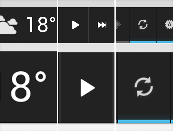
As much Android deserves the love for the great freedom it gives to its users (try to install a file manager to your stock iPhone or copy music to a friend’s computer), the user interface is just not there. They surely have put a lot of effort into Jelly Beans, but the devil is in the details. Look at these widgets, for example.

different colors, sizes, outer glow – on stock elements
In every operating system, at least the stock widgets should look alike – but, to mention just a few flaws, the three main widgets (power control, music and weather add-ons) are different in size, colors and they use different spacers between the buttons. The widgets coming from 3rd party developers in Google Play are not much help either: even the ones that claim support for the stock Ice Cream Sandwich are missing the guidelines with a mile or two.
Maybe Google’s development teams don’t work together very well. Maybe the UI teams’ quality assurance is missing. Maybe they just don’t care, because manufacturers like Samsung, Motorola and HTC have their own design tweaks anyway.
Either way, in 2012, the pixel-perfect paradise is not here yet.