What’s the secret of creating products that age well?
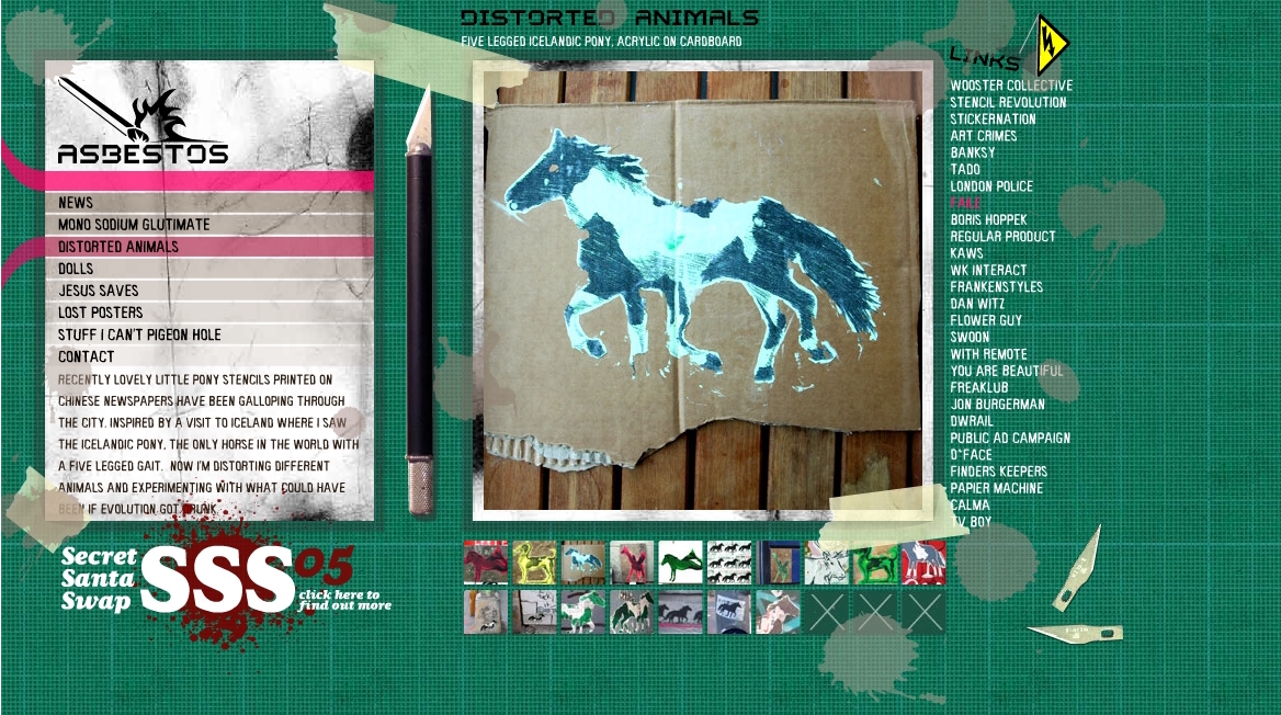
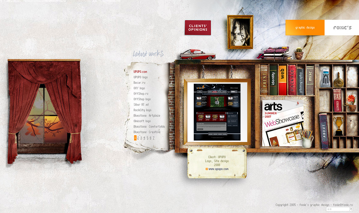
I’ve been cleaning up my old disks this weekend and found these screenshots of webpages from 8-10 years ago. I used to send these pictures to designers to explain art direction choices, so this collection is essentially an insight into graphics trends a few years after the millennia.
Shortlisted here, five webpages that look a bit more fresh than the rest. Let’s revisit them briefly: which designs could you get away with today (and why)?
A fun exercise for the next art direction meeting: how would you change your products right now to make sure they will look ok-ish in 2026?


