Redesigning Verzetteltes (on Blogspot)

If your girlfriend has an amazing blog, has more and more visitors every week, and you happen to be an UI guy, the least you can do is to make the blog look as pretty as its content – especially if you already promised to do so. Since our experiences might be useful to others running blogs on Blogspot, here are is a few words about the process.

A custom domain really is a must for all serious bloggers, so that was the first step. Since Blogspot (aka. Blogger) is a Google service, this was a rather easy part with a “next-next-finish” experience. That was actually the only thing we had to pay for, with the total cost of about ten bucks.

Before having any graphics done, we agreed on trying to keep the tools Blogspot provides to its users: widgets, social buttons for posts, tagging and so on. This introduces loads of constraints, but in the end, leads to a more flexible blog. Based on the current layouts I created a semi-template, and we started to design: with Katrin’s eyes and my hands we have put together some fine graphics in the end.

Because the already given structure and most of the markup generated by an unknown engine, for the sitebuild, the best approach seemed to be to use a template that is already available on Blogger. We have found one that was quite similar our layout, so I started the work based on that. With the help of Opera’s Dragonfly, the final CSS was done. Luckily I managed to avoid doing serious modifications on the DOM; keeping most of the original markup helped a lot in the integration process.

In the design we used a font that is not present on all platforms; to be able to use American Typewriter for the post headers without Flash, I used Cufon and some font support javascript that was already available for download somewhere.

As a final touch, I removed the Blogspot header as well. Now, I’m not sure if this was a legal move, but Verzetteltes looks much better without the blue strip, and there are a bunch of blogs on Blogger that are already doing that. In the worst case, I’ll be able to write about how to move a blog from Blogspot to WordPress as well.

For the image resources we added, we needed some online storage as well. For this purpose we used Google’s Picasa service – the few images we had easily fitted the free quota. All the JS and CSS content is wrapped in the HTML template, which is not the prettiest solution but seems to be a Blogger best practice.

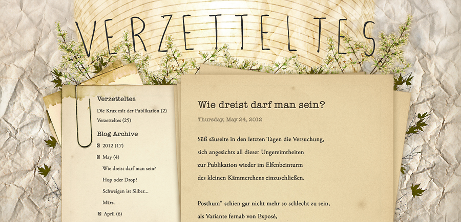
Katrin’s blog is available at www.verzetteltes.com
j j j

The power of Facebook

There is a project, started a few years ago, where everything is about smiles: parents get professional photos of their kids, shopping malls get new visitors – and the website of the project gets lots of attention. After we integrated Facebook this year, it got five times more.


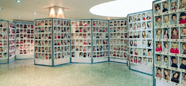
Image from MosolyOlimpia.hu

SmileOlympics is a one week event in shopping malls, where children and their families are photographed in the old-fashioned way. The picture taken is a gift for the parents, and there is a smile-wall set up in the venue where visitors can browse through the whole gallery.

After the event there’s an online competition, where users can vote and the photo with the most votes receives a prize. The website was designed in 2006, and not much happened since then: users could register, log in and vote for any pictures they liked. Of course, on an event like this, the customer support had loads of work – people registered with fake e-mail addresses faster than the moderators could delete them, and most of the mothers wanted to know how the other ones kid can have ten times more votes.

As this year the project will become a road show rather than a once-a-year event, we had the resources to improve some bits – and we integrated Facebook in order to prevent multiple registrations. Dumping all the user data we had (well, not quite… but you get the point), we decided to go with Facebook login, and we replaced the voting system with Like buttons. To make sure that users can’t vote before or after the one week competition, we created a database that is synced with Facebook only in that period.

At this point we were afraid of losing users: since it was possible to vote on Facebook without even seeing the website, some users had no reason to do so – to get around this, we had two things in mind. First, we created a Facebook page to reach more users, and provided information and the customer service there as well. Second, we made another competition running: whoever liked at least five photos on the website, could also win a prize.

The results were astonishing: on the first day of the competition, we registered five times more users than in the previous years, 90 precent of whom came from Facebook (compared to about 10 percent in 2011). From Monday to Friday evening Google Analytics registered 30K unique visitors, and after the first two weeks, at this moment there are 2450 likes on the Facebook page. All this without changing anything else on a 6 years old website.

That’s another smile here.

j j j