As the 2012 London Summer Olympics reaches its end this weekend, we will see a very different logo when someone talks about the Olympics: the one Rio unveiled on New Years Eve last year. And the more we see it, the more boring it will get – it’s simply too shiny to be interesting through the next four years to come.

Rio Summer Olympics 2012 (from the video on Youtube)
Don’t misunderstand me: I think the graphics team is brilliant and the logo is beautiful. It has nice thoughts behind, the execution was great, the emblem and the ‘Rio font’ is authentic and really pretty. The logo makes a clear identity and will live on the website, in 3D, on prints and on thousands of different materials. It’s just that they played a bit too safe.
Every year has a visual trend. My favorite way to show the change in the mainstream visuals to others, to make them look at the cars passing by: all vehicles made in the same timeframe have similar headlamps, shapes, colors, interiors – leaving us with snapshots of tech driven development for 2-3 years. The same goes to fashion (which I have absolutely no clue about), and to design as well: do you remember the early 2000s, when all web 2.0 logos had a gradient and a reflection?
To make a logo age better, it’s not enough to simply make it fit the nicest visual key you can come up with. You have to create a vision and a clear message, and stick to those – just like London did with the 2012 Olympics: going with these progressive looks was risky, and people hated it four years ago. By today though, the vivid colors and the hipster-look got understood.
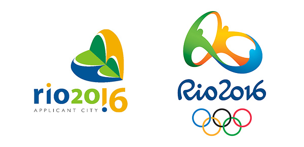
Quick evolution: applicant city and Rio 2016
It’s worth to take a look at the list of all olympic logos from the last 90 years. All of them are great artworks, it’s fair to assume that they are the top notch designs of their age – how many of them look still interesting? Are those the ones that were accepted by the crowd immediately?
That’s the problem with the 2016 logo: according to Wikipedia, the emblem was based on four concepts: contagious energy, harmonious diversity, exuberant nature and Olympic spirit. Clear? Not really. If you want to stick out of the crowd, you have to invent something new. Even the best design team will be useless with an idea based on such bullshit.
At least in the long run.
