In general it’s worth watching how big brands redesign their products from time to time. Whether it’s carmakers applying facelifts to their vehicles, or Coca-Cola tailoring its image for a new audience, the design trends they follow can be determined with great accuracy.

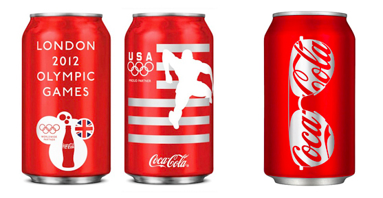
London 2012 and Summer 2011 cans (images from DesignBoom and TheAWSC)
The idea for this blog post came from Coca-Cola’s limited-edition cans which they created for the USA team on the London Olympics 2012. Having Coke’s colors and image as a base, the graphics made full use of Transport For London’s strong corporate identity: its very minimalistic style is blended in the design as well as the original Johnston typeface.
Minimal is not completely new for Coca-Cola, last year they unveiled a summer collection that had a similar touch to it: simple silhouettes of every day objects with the company’s logo in them. That gives us a great opportunity to observe how “minimal” changed in a year.
Now, at least for London, the graphics became much softer, cleaner, the forms lack those sharp edges and tiny lines – but they are not monochrome anymore. The designers applied more shades of red, white and grey and even blue – and seem to used more tools: drop shadows, overlaying objects etc. With all these tweaks, the new can designs look cleaner and more minimal, while having significantly more detail. Quite a few magicians working there.
Called the Coca-Cola ‘Eight-Pack’, the cans designed by design studio Tucker Duckworth feature graphical silhouettes of some of Team USA’s Olympic champions, medalists and hopefuls in action within their sports.
More Coke cans from the last four decades at coke-cans.com.


