Goodbye Nike+, welcome miCoach

As you may remember, I started to track my runs with Nike+ just about two months ago. Since then we shared a few moments (ten sessions and 50 kilometers) – quite enough time to know: I need something else.

Adidas miCoach - about Android, web, tech from Richard Dancsi
miCoach – slightly less style

The main reason for the break-up was something that’s not the really Nike’s fault: their app is only for running. Because I like to track my cycling routes as well, I had to have a separate app for almost the exact same thing: see some speed and location data on a map.

And since miCoach from Adidas (the Android version) was already there, I couldn’t help to see the advantages of it:

1. Better statistics: shows my actual speed in time (not only green/yellow/red colors), average by kilometers, fastest km, elevation data etc. Just perfect.

2. Works without registration. (Now, I registered anyway so that I can see my data online, but I really like the fact that I didn’t have to for using the app.)

3. Feels more accurate. Sometimes Nike+ showed 100m as the distance so far, right at my 600m turn (I used to run on the same route a lot.)

Some drawbacks:

1. Slightly worse UI. Not bad, not ugly, but well… Nike+ really was top notch on that.

2. miCoach asks for a code every time I start it. (Why? Anyone who gains access to my phone, could check my emails, Twitter, even payment data – but not how far I ran? It really doesn’t make sense.)

3. I have no idea, how the achievements work.

Well, let’s see how long this relationship lasts.
j j j

Run, Forrest, Run (and track it)

Tracking runs and other sports is great fun, even if it means carrying another device. I got addicted to more data about my runs sometime last Summer, and tried half a dozen of apps since then. Now that the last update broke ‘My Tracks’ on my phone, it was time to look for a new one.

To look for a tracking app on Google Play is not easy though. There are hundreds of them out there, almost indistinguishable from each other and to make matters worse, I already have some preferences. They should be small, easy to use, easy to set up – and especially, don’t need any kind of registration or whatsoever. In fact, the less features the app has, the more I should like it: display the position on a map, measure time and speed – that’s all one can need.

I can’t really say why I did download Nike’s running app then. You have to register on nike.com before the first use. I don’t want to share anything on my Facebook wall. The app is huge. (16 MB, really? Will it do my runs for me?) And it’s not made by some nice indie developers on an island, but Nike, a giant. Yet, I did download it and tried it just now.

And I loved it!

The registration is annoying. I don’t even know what a calorie is, but it keeps showing me how many less of those I have. It always wants to share my embarrassing results with my friends and followers. But there is something to it that I really liked.

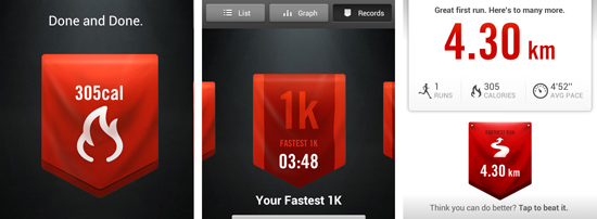
Great graphics, for starters. And while I’m not at all interested in calories, I really do like how it is displayed, together with the longest distance, fastest run etc -it’s just great to look at those screens. The whole lot is perfectly made and has some spirit, some unique touch to it. And the best thing is: I can’t wait for the next time to use it.

This app is a brilliant lifestyle product. Nothing less.

j j j